You're already spending money on ads.
People click through to your product pages, browse for a bit, and then leave.
Out of 2,000 visitors, only 30 make a purchase.
1,970 people decided not to buy.
That doesn't automatically mean there's something wrong with your product. It usually means something in the experience caused hesitation or friction at the wrong moment.
That gap between traffic and sales is exactly where ecommerce conversion rate optimization comes in. And this is what many store owners get wrong — they try to fix it based on their own opinions instead of actual user behaviour and data.
What is conversion rate, exactly?
Purchases divided by total visitors, multiplied by 100.
If 100 people visit and 2 buy, your conversion rate is 2%.
The average ecommerce conversion rate sits between 1.5% and 2.5%. That means 97 to 98 of every 100 visitors leave without buying.
Usually you don't need more traffic. You need more of your existing traffic to convert.
That's CRO ecommerce work. And it starts with one page: the product page.
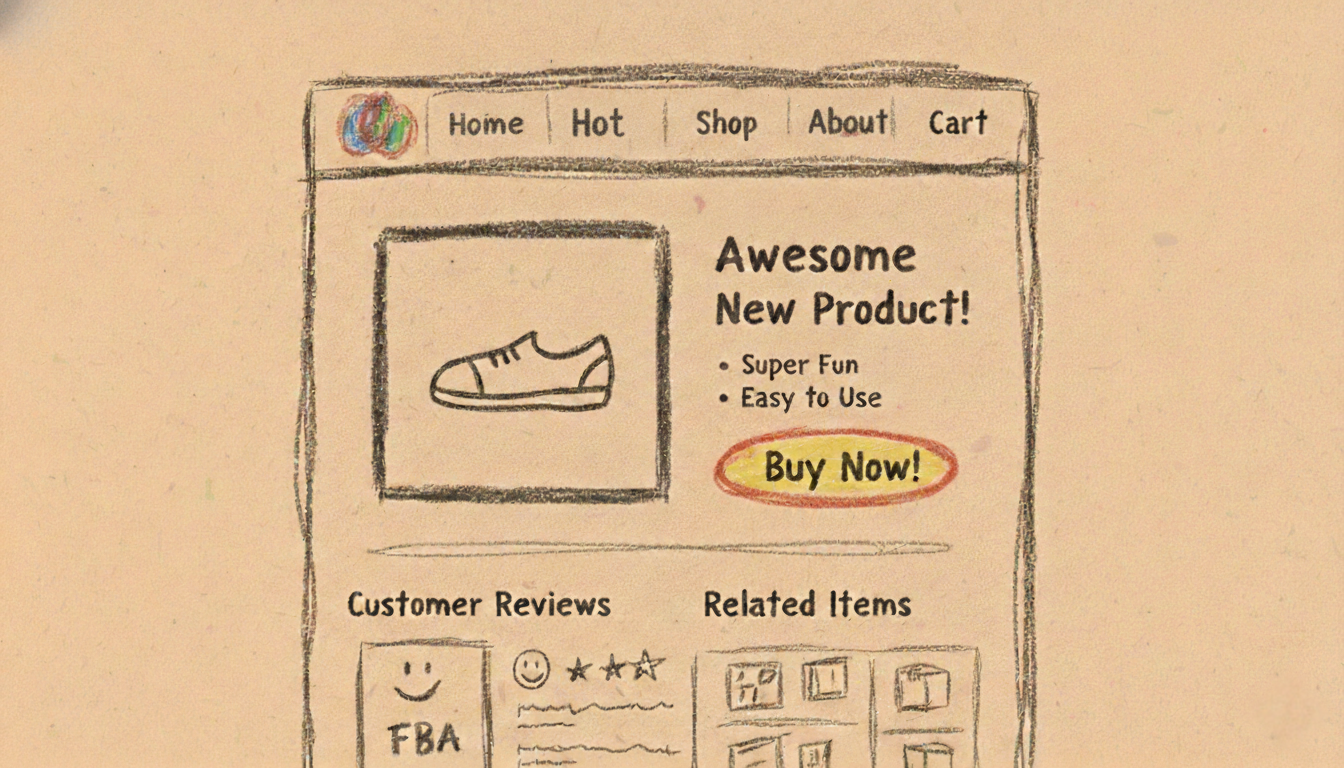
The 9 elements on your product page that make or break conversions
Most product pages leak revenue. Visitors drop off at every section. The fix is knowing exactly what to optimize.
| # | Element | What to do |
|---|---|---|
| 1 | Headline | Lead with outcomes, not features. 80% of visitors read only the headline — if it describes what the product is instead of what it does for them, they're gone. |
| 2 | Subheadline | One line that connects the headline to a specific use case. Show them why this product fits their situation. |
| 3 | Hero image or video | Show the product in context. A water bottle next to a hand tells a different story than one on a white background. Video reduces uncertainty faster than any other element. |
| 4 | Price & payment options | Show the number clearly. Add BNPL options like Klarna. Breaking the total into four payments reduces hesitation at the exact moment people are deciding. |
| 5 | Add-to-cart button | Color, copy, and placement all matter. Test "Add to cart" vs "Buy now." Keep it above the fold — never make them scroll to take action. |
| 6 | Social proof | Reviews with photos, star ratings, units sold, live viewer counts. Real customers approving your product does more than any marketing copy. |
| 7 | Guarantee & return policy | Free returns and a 30-day money-back guarantee remove purchase risk. When you promise to take the product back, visitors stop worrying about wasting money. |
| 8 | Shipping & delivery info | State speed, cost, and free shipping threshold on the product page. Most cart abandonment happens when people see unexpected shipping costs at checkout. |
| 9 | Trust badges | Security seals, payment logos, SSL certificates. Lower anxiety about credit card fraud and data privacy. Place them near the add-to-cart button. |
Headline
Lead with outcomes, not features. 80% of visitors read only the headline — if it describes what the product is instead of what it does for them, they're gone.
Subheadline
One line that connects the headline to a specific use case. Show them why this product fits their situation.
Hero image or video
Show the product in context. A water bottle next to a hand tells a different story than one on a white background. Video reduces uncertainty faster than any other element.
Price & payment options
Show the number clearly. Add BNPL options like Klarna. Breaking the total into four payments reduces hesitation at the exact moment people are deciding.
Add-to-cart button
Color, copy, and placement all matter. Test "Add to cart" vs "Buy now." Keep it above the fold — never make them scroll to take action.
Social proof
Reviews with photos, star ratings, units sold, live viewer counts. Real customers approving your product does more than any marketing copy.
Guarantee & return policy
Free returns and a 30-day money-back guarantee remove purchase risk. When you promise to take the product back, visitors stop worrying about wasting money.
Shipping & delivery info
State speed, cost, and free shipping threshold on the product page. Most cart abandonment happens when people see unexpected shipping costs at checkout.
Trust badges
Security seals, payment logos, SSL certificates. Lower anxiety about credit card fraud and data privacy. Place them near the add-to-cart button.
Those nine elements are your checklist. But checking boxes without customer input is just guessing.
How to find the real conversion barriers
You don't know why visitors leave. You think you do, but you're probably wrong.
The only way to know is to ask your Ideal Customer Profile directly.
Here's how:
Step 1: Source 20 to 30 people from your ICP
This is probably the hardest part. Don't ask friends or family. You want to ask real people from your Ideal Customer Profile (ICP).
Go find:
- Past buyers who almost didn't purchase
- Abandoned cart users
- Social media followers who engage but haven't bought
- People in Reddit communities related to your niche
Remember: ask real customers or very close lookalikes.
Step 2: Ask targeted questions without leading them
Bad question: "Was the shipping cost confusing?"
Here are five non-leading questions that work:
- What almost stopped you from buying?
- What did you hesitate about on the product page?
- Was there any information you wanted but couldn't find?
- What would have made you feel more confident in your purchase?
- Describe the moment you decided not to buy. What specifically triggered that decision?
Don't overcomplicate the questions and don't put too many.
Step 3: Run 20 to 30 surveys
Surveys give you volume. Send them via email, put them on your thank-you page, or run them through Typeform. Aim for 20 to 30 responses minimum.
Optional but powerful: conduct 5 to 7 live interviews. The patterns become obvious when you hear people describe their hesitation in their own words.
Step 4: Find the patterns
Tally every complaint and hesitation. Count how many people mentioned the same issue.
If eight out of 20 people said "I couldn't find the return policy," that's a pattern.
Step 5: Fix the top 2 to 3 elements mentioned by at least 50% of your ICP
Don't fix everything. Fix the biggest problems first.
Stop guessing how to increase conversion rate ecommerce
This approach will feel uncomfortable at first.
You're going to have to talk to people.
You're going to hear real feedback. Not all of it will be positive.
People will point out what's confusing, what's missing, and what made them hesitate.
Once you see where people get stuck, you can fix it.
And when you fix the right things, conversion rates move.
How Brightverse helps you increase conversion rates for your ecommerce store
Somewhere between "add to cart" and "complete purchase," your traffic is dropping off. You're losing money you've already spent to acquire.
Our ICP method works. But doing this alone takes weeks — sourcing survey respondents, writing questions that don't lead, identifying patterns, prioritising fixes.
Or you can hand your product page to a team that's done this hundreds of times.
We'll do a quick call to understand your brand and what you're working on, and see if this is something that you need.
Stop guessing. Start asking your customers.
Get in touch